
You may have noticed a few changes, but we’re thrilled to officially announce that we’ve got brand new packaging! While the shipping boxes and bags may look a little different, we’re still the same great SPATULA with all the benefits you already know and love, like dishes ready in just 10 minutes and no need to defrost, prep, or deal with mess.
Being able to move from stickered bags and boxes to fully printed options is a big deal for our start-up, as it shows our hard work is paying off and leading to continued growth in many areas! The new packaging has so many benefits for us as a small local business like allowing us to unlock time savings. In the interest of transparency for those curious or wanting to become entrepreneurs themselves, we’re happy to share them. For example, our new packaging allows us:
We’ve also asked the creative director behind our new packaging to share some behind-the-scenes details of how our new bags and boxes came to life! Before we dive into her Q&A, let’s share the perks of our new packaging!
Packaging our dishes in record time
After we flash-freeze our dishes, we need to get them packaged up and back into the freezer quickly to avoid any melting. While we do keep our packing area quite chilly to buy us some time, these bags are slightly larger than our previous ones so we can get the flash-frozen, air-tight food into the outer bags faster - no more trying to squeeze them in! This also means you’ll be able to remove the food from the outer packaging more easily at home! It’s a win-win.


Left: SPATULA’s original branding and packaging; Middle: SPATULA’s previous packaging; Right: SPATULA’s new packaging.
Reducing the time spent stickering
Like so many others, we believe arts and crafts can be a perfect opportunity to relax and give our minds a chance to unwind. However, preparing our dishes for our loyal customers is not arts and crafts time. Previously, our highly skilled team would spend hours attaching labels to our outer bags and shipping boxes, making sure they were applied straight and without any bubbles so your SPATULA orders arrived looking flawless and Instagram-ready, just for you. With our new printed bags and custom boxes, our expert team of chefs can spend more time focussed on cooking up delicious food and less time on stickers, as it should be!

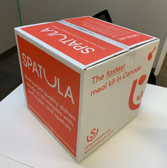
Left: SPATULA’s original shipping boxes; Right: SPATULA’s new shipping box.
Designer Q&A
There was lots of opportunity with our old packaging and shipping boxes, so we sat down with our designer Rachel Baitz to ask how it all came together.
Q: How did you approach this task, updating and improving the packaging designs?
A: It was an exciting opportunity for me to showcase SPATULA’s voice and branding while making sure all the necessary information for our customers was front and centre.
The boxes were incredibly fun to dream up, as there weren’t many elements that were required or regulated (like barcodes, etc.), but it did mean that I had to reign in my imagination a bit - which, as all creatives know, can be the hardest part! I think we went through about 5 or 6 iterations, all of which were so different from each other. In the end, we wanted something that would pop, be slightly sassy, and inform anyone unfamiliar with SPATULA what we are, at a very high level.
The printed bags presented a bit more of a challenge, for a few reasons. I thought the existing labels were already beautiful, with the illustrated ingredients falling into the wide U of the logo, so I was a bit worried I would end up with a design that didn’t maintain that simplicity, especially because the printed bags had to follow Health Canada regulations and needed to include a UPC barcode via GS1, which also comes with its own guidelines.
I had to ensure that the cooking instructions were clean and visible, an image of the food itself was present, the UPC barcode was scannable and followed regulations, and add in details about who SPATULA is, what we offer, and where to find more information, should someone pick up a bag in a retail store without the context of our website. All of that information couldn’t overwhelm the most important details (like how to prepare the dish), or the simplicity of SPATULA’s branding. It was a fine balance, but I think the end result accomplished that, and the team is really proud of where the bags’ designs ended up.
Q: How did you decide which additional pieces of information would go onto the boxes and bags?
A: If you’re familiar with large corporations, they always talk about their vision, mission, and values. Brands also talk about their reasons to be (RTBs), what differentiates them from competitors and explains why they need to exist in the market. If we were to boil down everything SPATULA stands for into one, wildly oversimplified statement, it would be that everyone deserves the convenience of quick, foolproof, and delicious dishes at home.
That statement encapsulates and reflects us being Canada’s fastest meal kit, with dishes ready in 10 minutes. It also speaks to the quality of our meals, as we intrinsically value the expertise offered by chefs and the calibre of a restaurant quality meal.
For the shipping box, we wanted that core belief to be immediately clear to anyone who sees the box without knowing SPATULA. This includes our delivery partners, our customers’ neighbours, etc. So we put “Canada’s fastest meal kit” front and centre, along with our tagline that reminds everyone that you can whip up restaurant quality meals with nothing more than a pan and spatula - no previous experience needed. We’re incredibly proud to be a Canadian company and a mealtime option for new parents, busy professionals, and those just gaining confidence in the kitchen so our “no prep, no mess” promise had to be visible, too.
Our printed bags were a bit different: anyone holding the bag of food and reading the packaging was likely to be A) someone about to prepare their meal, or B) someone considering purchasing SPATULA for the first time. If they’re already chosen their dishes and are ready to enjoy, the dish name and cooking instructions were pretty much all they’d be looking for. Anyone new to SPATULA would need a bit more detail than that.
The front of the printed bags note that our dishes are ready in just a few minutes, and that our dishes are proudly made right here in Canada. We wanted to keep the minimalist tone of our branding, so the back of the bag features incredibly simplified versions of our RTBs: “no prep, no mess”, and “restaurant-quality”. We also included a note that there’s many more dishes to discover online with our full menu, and we added a QR code so anyone seeing our product for the first time can quickly get a better sense of what we offer.
Q: If you could go back to the start of the design process, what would you do differently?
A: I’m a big fan of easter eggs (thanks, Taylor Swift!), especially those hidden in plain sight on products and packaging. The more clever and cheeky, the better. I had tried to sneak in a few really sassy details on the shipping box (for example, on the bottom of the first design iteration, it originally read: “We know you’re excited to get into these delicious dishes, but this box opens from the other side.”) but the design changed, and it no longer fit the overall tone of the piece. If I did this process again from the beginning, I’d probably push harder to include more of those - I think they’re fun!
While we may look a little different when your next order shows up, we promise that the quality and taste you love won’t have changed at all. Want to see the new look up close? Get started now!